With the Galaxy S8, Samsung grabs the smartphone design crown
With the Galaxy S8, Samsung grabs the smartphone design crown - In the interest of full disclosure, I'll admit my bias right up front: I have never liked Samsung's smartphones. The Galaxy and Note series have both been wildly successful -- so much so that they basically cemented Samsung's status as Apple's equal in the smartphone war, at least here in the US. But the cheap plastic design and overwrought software found in early Galaxy devices turned me off, to the point that I thought I'd never take their phones seriously.
When a few colleagues started talking up the Galaxy S8 after an early preview, I remained skeptical. Yes, the company had been taking big steps forward in industrial design over the past two years, but I just couldn't imagine how something with screens this large could be comfortable. (We all remember the tragedy that was the massive Nexus 6.)
How wrong I was.
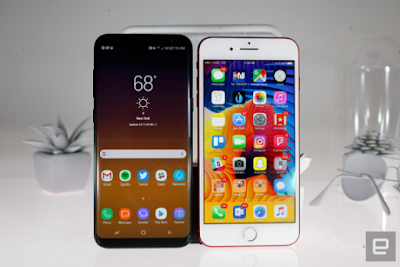
Ever since Samsung first unveiled the Galaxy S8 late in March, I've had to eat my words. At first, a phone with a tall, 18.5:9 aspect ratio seemed to be a strange design decision, but it was the right one. Despite its massive screen size, the S8 is basically the same width as phones with much smaller displays. Keeping the S8 relatively narrow was probably the most important design decision Samsung made. The S8 measures 68.1mm wide, a scant 1mm wider than the iPhone 7. This size makes using the S8 with one hand absolutely a reasonable prospect, something I didn't imagine when hearing about a device with a 5.8-inch screen. It's something you really need to hold to appreciate.
I can't overstate how that completely changed my view on the S8. Don't get me wrong, it's still a Large Phone and not everyone will be able to use it comfortably in one hand. The tall aspect ratio also makes reaching UI elements at the top of the display challenging, for sure -- getting to the notification pane is trickier than I'd like. But all told, it's far more useable than I ever expected. (The S8 Plus manages a similar trick, packing a larger screen into a frame that's basically the same size as the iPhone 7 Plus. It's not a one-hand device, but it's still much smaller than it has any right to be.)
Indeed, it's not just useable -- it's downright enjoyable, more so than any other phone I've tried with such a massive screen. There will be some growing pains as app developers adjust to this odd new screen size, but the S8 is both immersive and beautiful. Holding and using the first iPhone was a magical and futuristic experience compared to every other phone that was on the market in 2007. Using the S8 feels the same -- it's the closest we've gotten to that sci-fi dream of having a glowing glass slate device to guide us through the universe.
Designing and then manufacturing such a device at scale was likely quite difficult, but it paid off. I'm far from the only one out there who now looks at Samsung as the undisputed hardware design master in the field. Quite a trick, considering most of the media coverage around the company in the last six months has focused on exploding phones. Assuming nothing goes wrong with the S8, I think we can safely say that the company has put its huge misstep behind it.
Even better for Samsung, it now has a good five or six months to bask in the glory. Apple will almost certainly unveil a new iPhone with an overhauled design, and it's hard to imagine that Google's next Pixel will keep its surprisingly large bezels, but neither of those phones are expected until the fall. That's a long time for Samsung to crow about its revolutionary new phone design, and it wouldn't be surprising if sales ended up reflecting that. Yes, LG's G6 has a similar bezel-less design, but the fit and finish isn't quite as excellent, and Samsung has been handily beating LG in terms of smartphone marketshare for a long time now. The S8 will only grow that lead.
Still, the Galaxy S8 isn't a perfect phone. I'd still vastly prefer the stock Android experience that Google offers on the Pixel, even though the skin formerly known as TouchWiz is now polished and totally usable. Bloatware remains a problem, and Bixby is not at all ready for prime time. Also, what's up with that fingerprint sensor?
But then again, no smartphone is perfect. And the good news with software issues is that they're often fixable -- particularly when you consider how relatively open and flexible Android has proven to be over the years. Software evolves and changes -- but when you buy a phone, you're usually committing to that hardware for a good two years. For the first time, I'd be willing to make that commitment with a Samsung phone. Source


